Sainsburys Online Groceries
Client
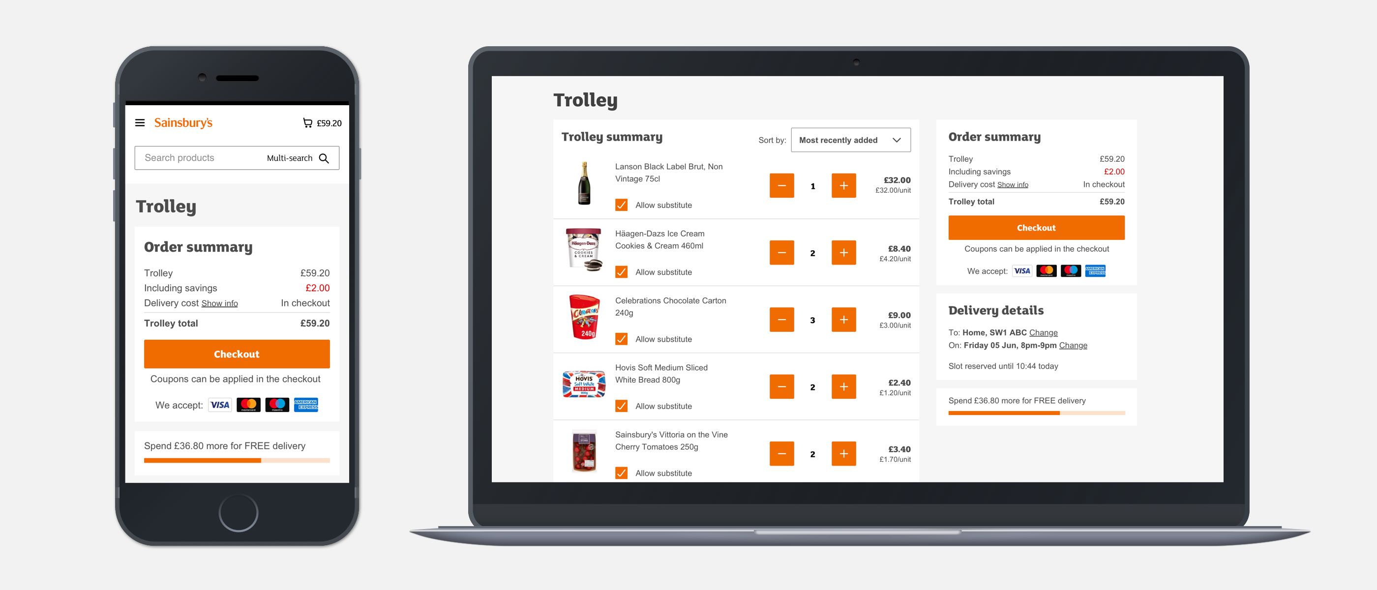
Sainsburys
Tasks
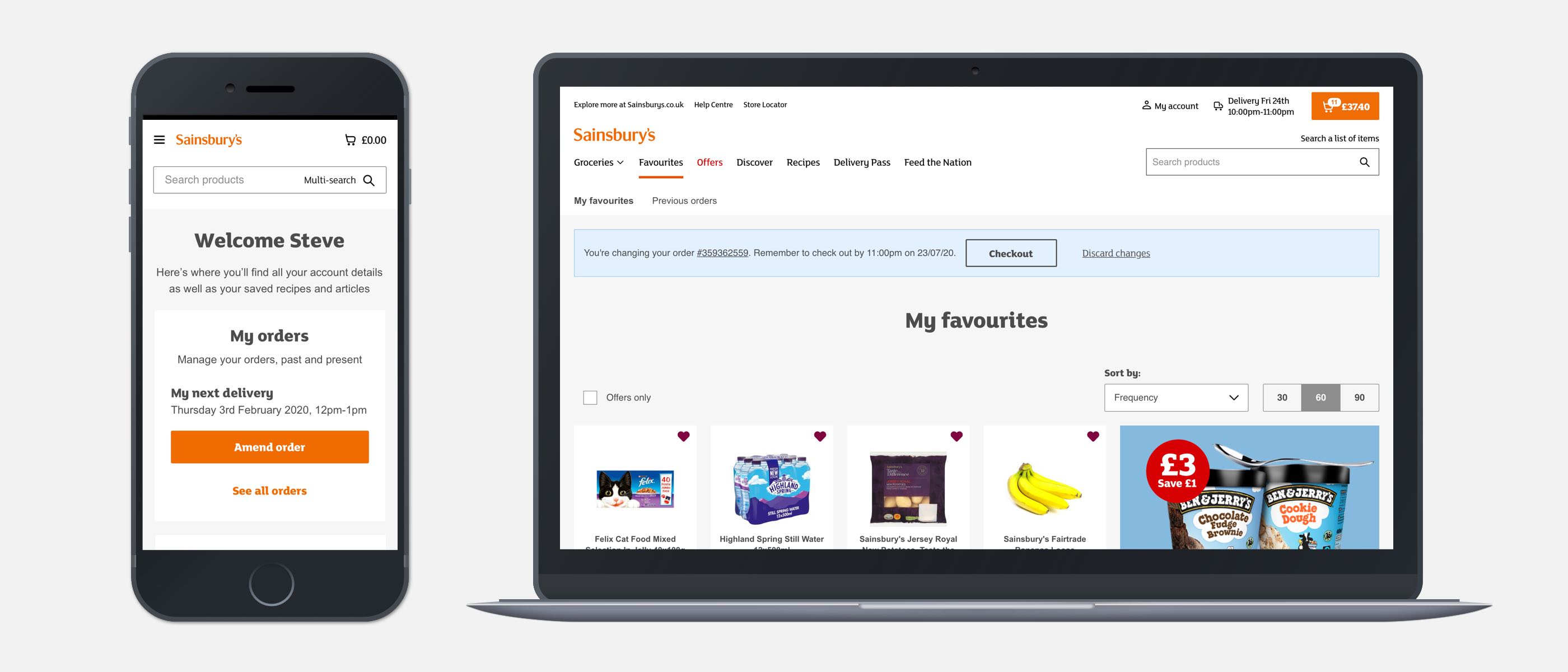
Background
Sainsburys is a major grocery retailer in the UK. Working with a Product Owner and developer team, I was assigned to the online basket, checkout and account touchpoints. I was also involved in the swarm team during the COVID-19 lockdown. The amend order experience; the journey of making edits to an existing order was heavily focused on improving.
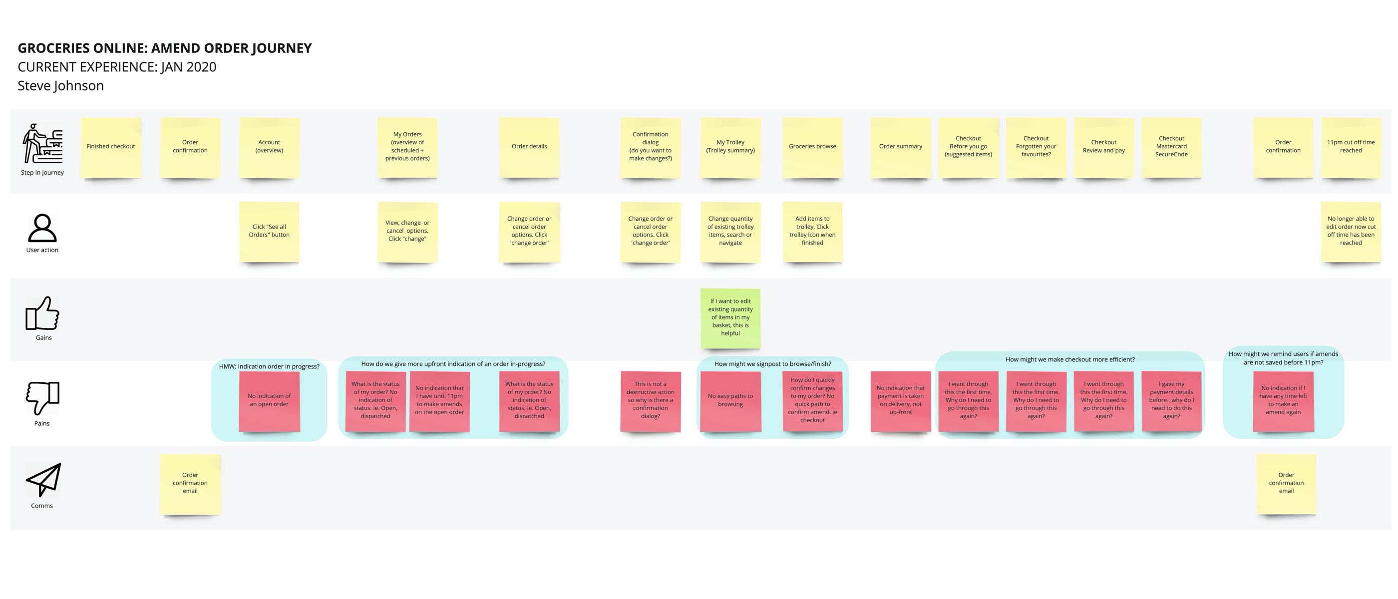
Existing user-pains and problems
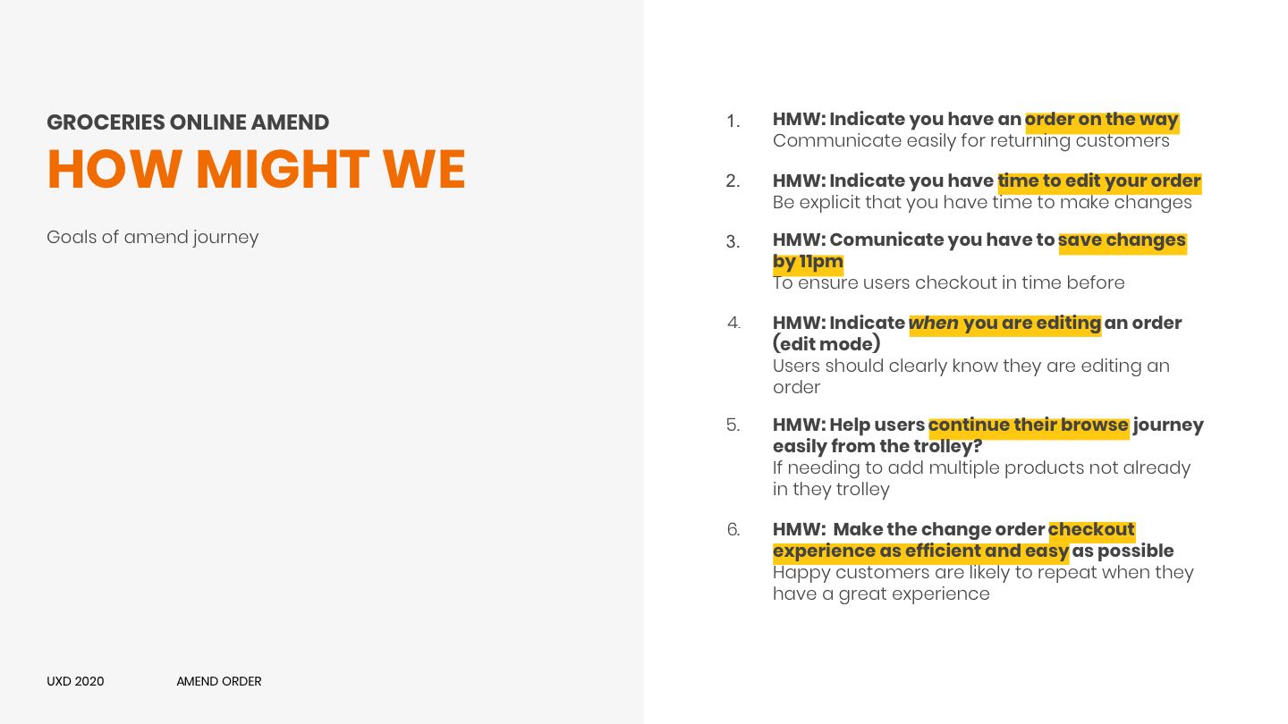
I created an end-to-end journey map of the amend order experience to ground myself and the team on what the biggest pain points were for users. After grouping user pain-points into categories, I framed six "How Might We" statements to counteract these problems.
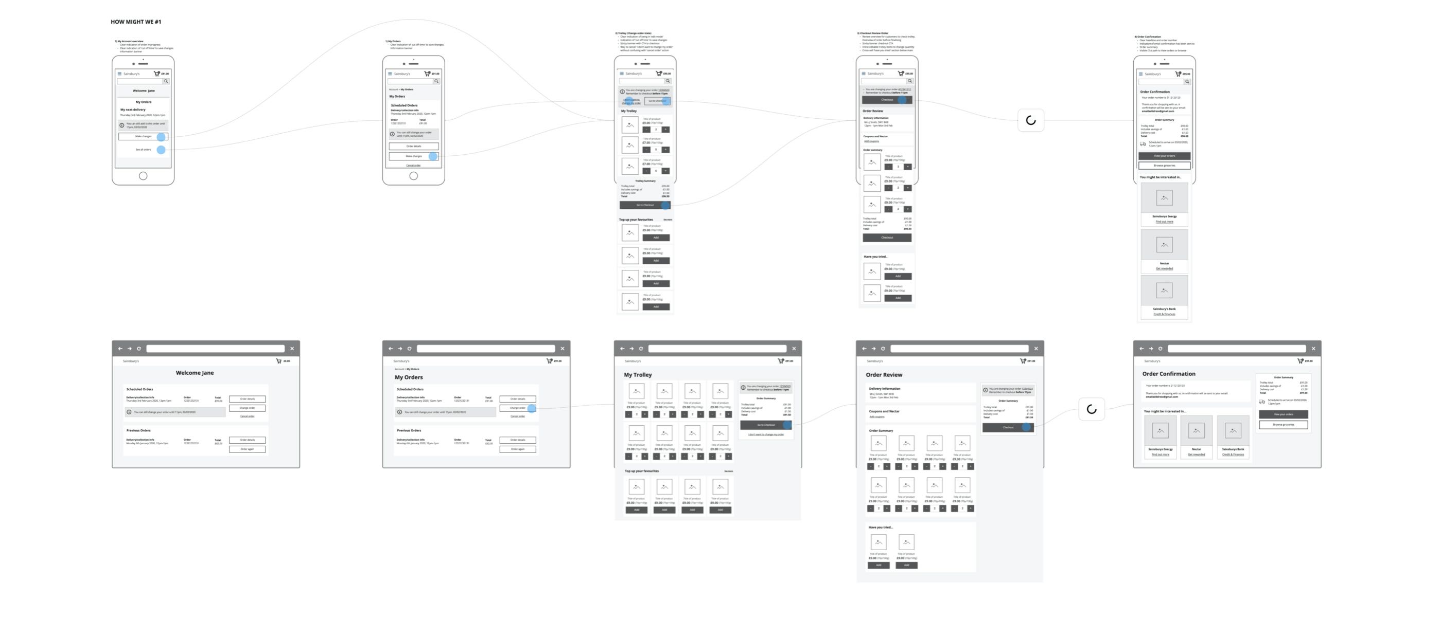
Low fidelity wireframing
On the homepage, the content hierarchy was improved for users to infer the type of website they were visiting and their available options. Links to the categories - experiences and gifts were made prominent above the viewport fold. Previously these were hidden in an expanded navigation drawer.
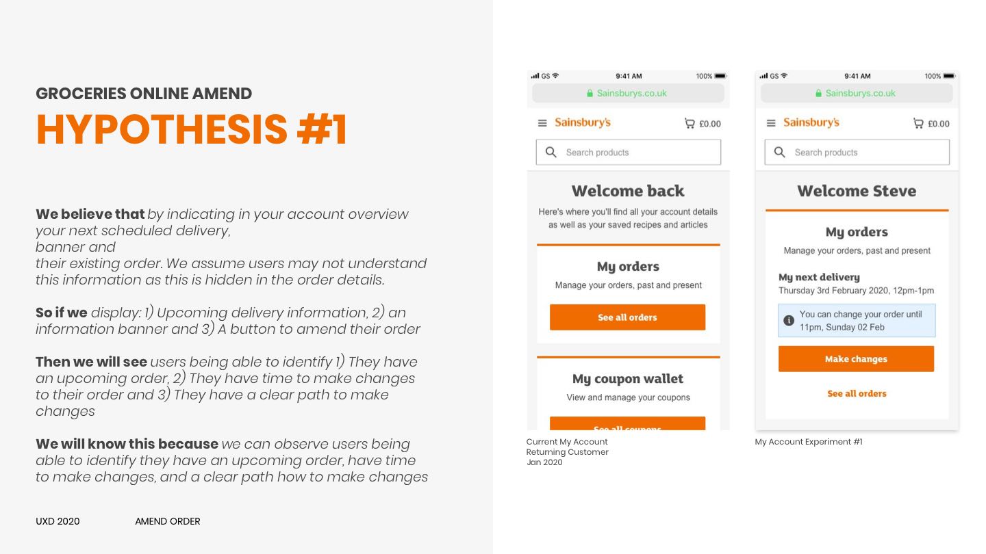
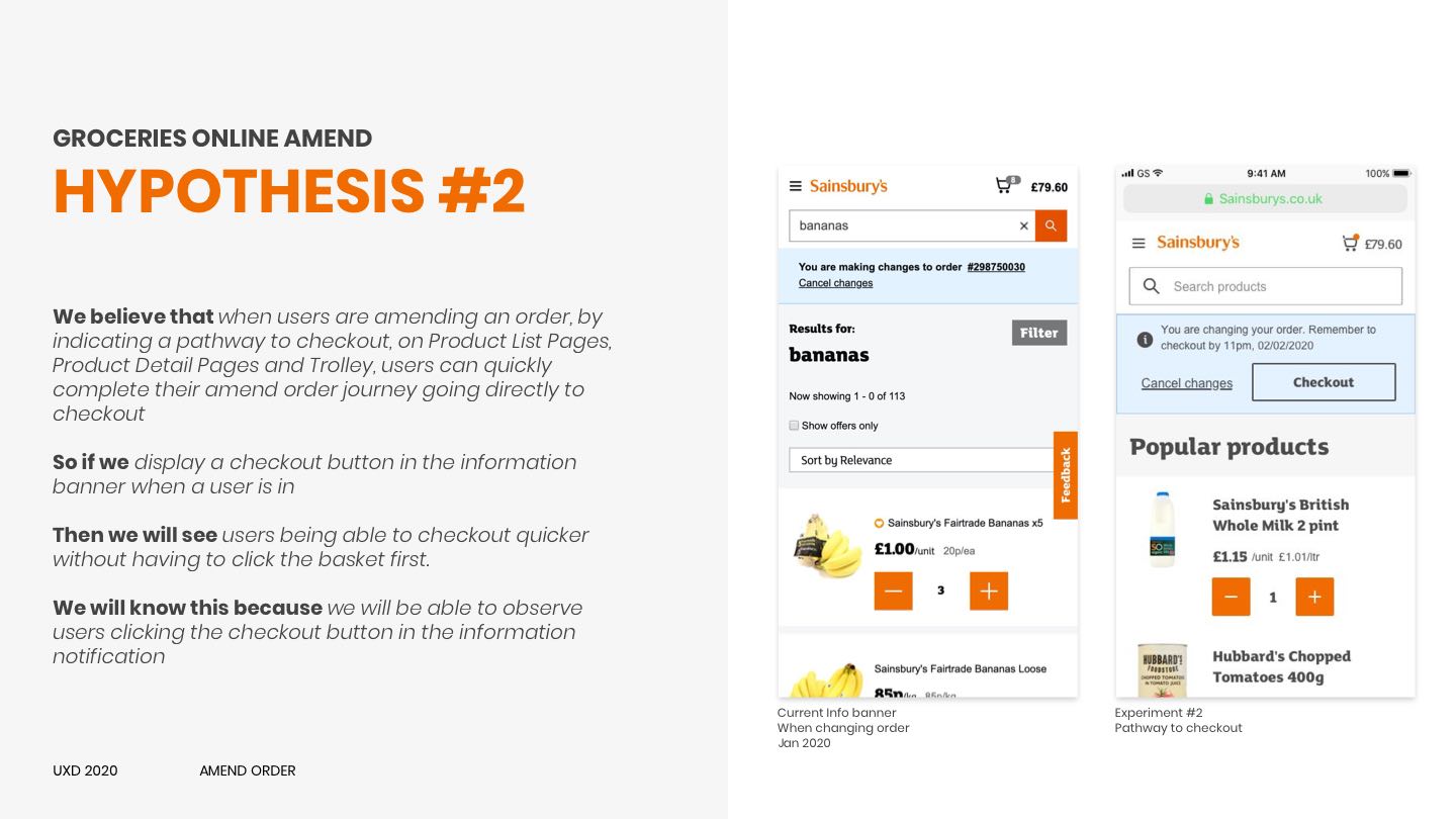
Hypothesis-driven design
On the homepage, the content hierarchy was improved for users to infer the type of website they were visiting and their available options. Links to the categories - experiences and gifts were made prominent above the viewport fold. Previously these were hidden in an expanded navigation drawer.
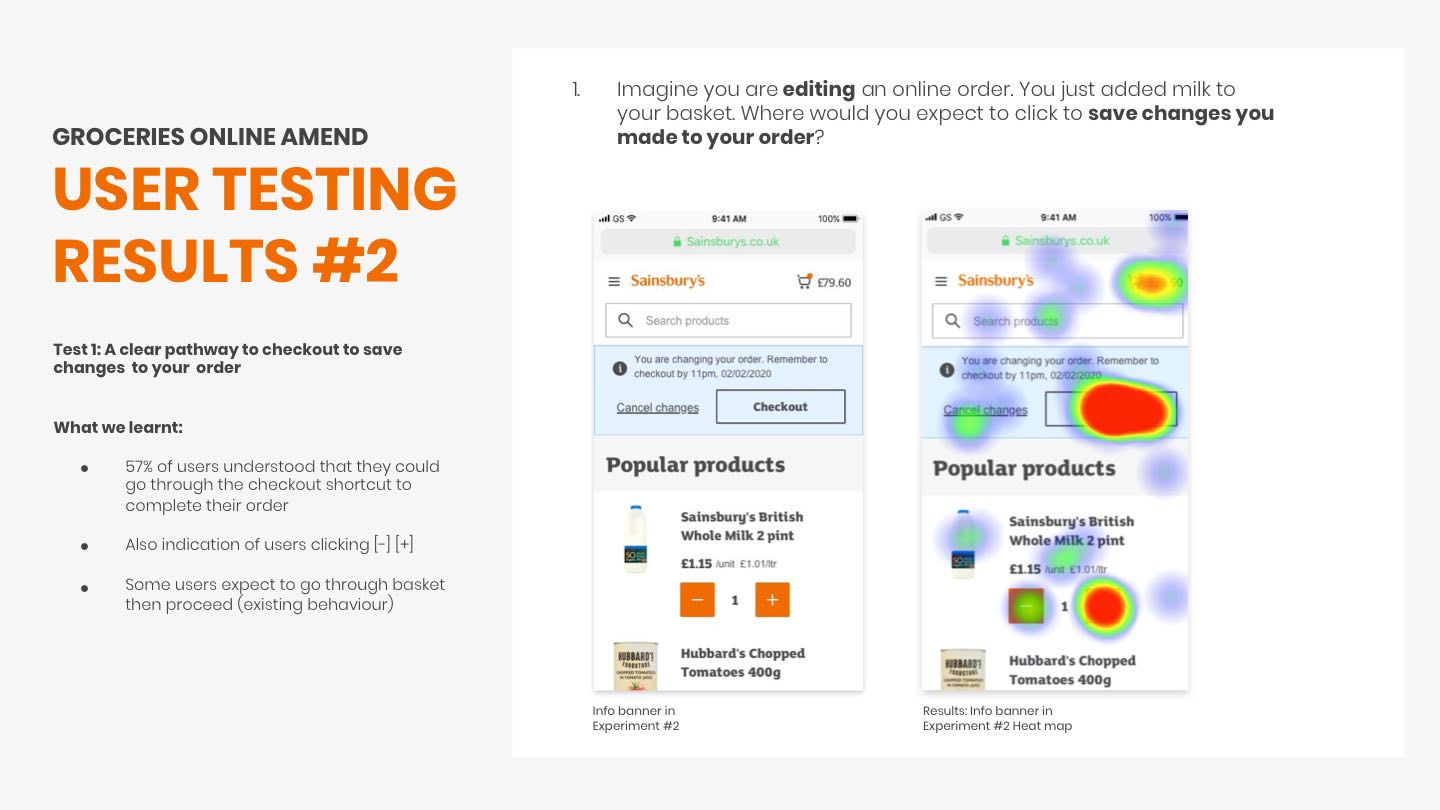
User-testing and validation
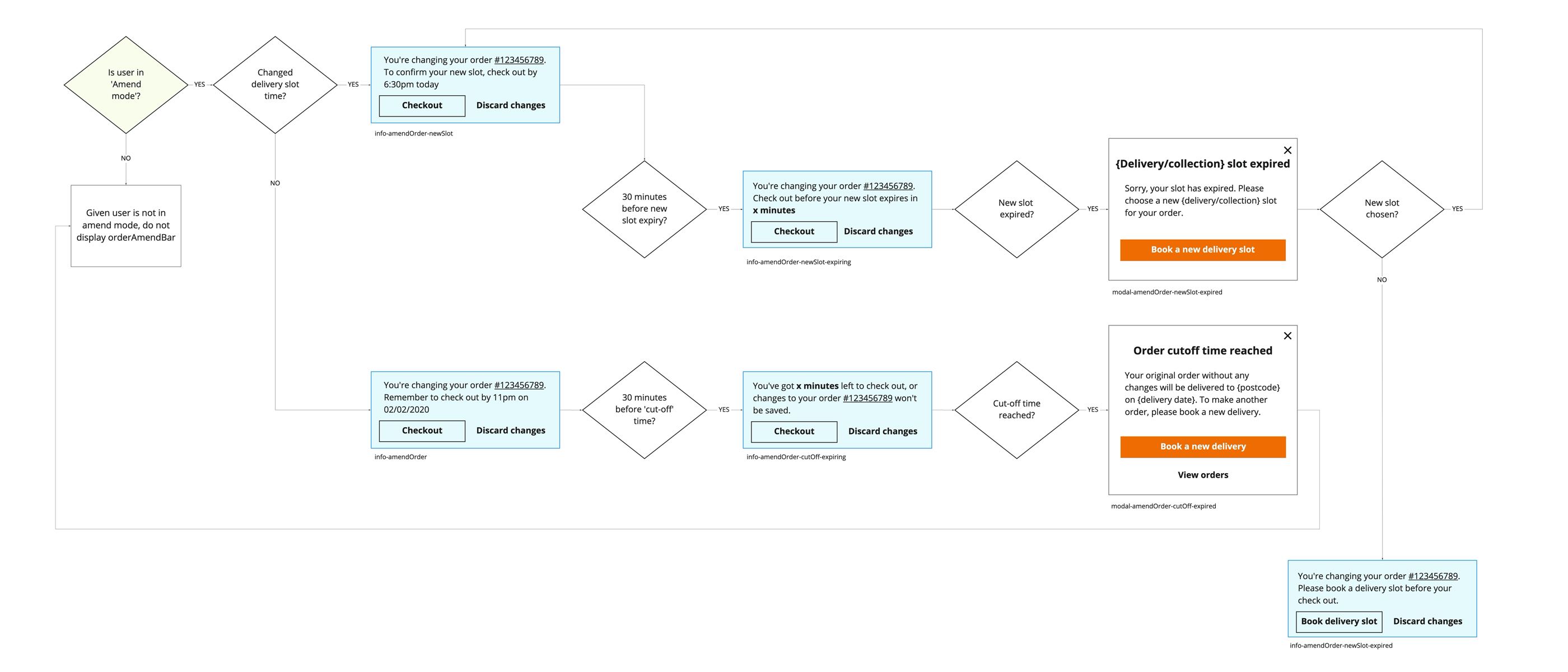
To test each design hypothesis, I did user click-map testing and questioning with screened online grocery users. The results validated both design hypotheses. To get this implemented on the website, I worked with developers to create story tickets with acceptance criteria.
Outcome and performance
On the homepage, the content hierarchy was improved for users to infer the type of website they were visiting and their available options. Links to the categories - experiences and gifts were made prominent above the viewport fold. Previously these were hidden in an expanded navigation drawer.
82%
Amends starting from My Account
Amend event tag, Sep 2020

+22%
Increase in conversion from Returning Users
Amend event tag, Sep 2020
